You are using an out of date browser. It may not display this or other websites correctly.
You should upgrade or use an alternative browser.
You should upgrade or use an alternative browser.
Windows 11
- Thread starter Overdriven
- Start date
dysfunction
FH is my second home
- Joined
- Dec 22, 2003
- Messages
- 9,709
Did a fresh install, my computer probably needed it.
And?
I have it on a USB and will be doing fresh install also sometime soon
Embattle
FH is my second home
- Joined
- Dec 22, 2003
- Messages
- 14,232
And?
I have it on a USB and will be doing fresh install also sometime soon
All went well, had to let it find some drivers to get rid unknowns in Device manager. The only one left at the moment is a Epson Scanner one but that is semi fixed.
I always like a fresh install, don't do it that often any more because it isn't needed as much as in previous versions of Windows.
I like it. I upgraded rather than re-installed and it seems much more responsive. There are still some weird UX issues - eg right-clicking on the desktop to bring up a context menu with an entry called "show more options" which, when clicked, brings up the old context menu (needed to get to graphics card settings). It just sometimes seems like they struggle to integrate the old with the new and end up just lashing them together as a last resort and it ends up looking like a bit of a bodge.
The centred taskbar will get some getting used to (it's a bit "Apple" for my liking and looks a bit ridiculous on a 3840 px wide ultrawide) and for some reason the "shake window to minimise all the others" feature was disabled but it's easy to switch back on in the settings.
I don't know that there's anything that warranted a whole new number rather than just a "21H2" update to Windows 10 but it all seems fine so far.
I'm not sure anything significant has changed under the hood - the vast majority of the changes are to do with the desktop UX, the shell, window management etc.
It needs to be fine with gaming, I've got Far Cry 6 preloaded and ready to go for the launch tomorrow. I've played a bit of Cyberpunk and Deathloop and it seems the same as before (scientific, I know).
It needs to be fine with gaming, I've got Far Cry 6 preloaded and ready to go for the launch tomorrow. I've played a bit of Cyberpunk and Deathloop and it seems the same as before (scientific, I know).
Embattle
FH is my second home
- Joined
- Dec 22, 2003
- Messages
- 14,232
I like it. I upgraded rather than re-installed and it seems much more responsive. There are still some weird UX issues - eg right-clicking on the desktop to bring up a context menu with an entry called "show more options" which, when clicked, brings up the old context menu (needed to get to graphics card settings). It just sometimes seems like they struggle to integrate the old with the new and end up just lashing them together as a last resort and it ends up looking like a bit of a bodge.
The centred taskbar will get some getting used to (it's a bit "Apple" for my liking and looks a bit ridiculous on a 3840 px wide ultrawide) and for some reason the "shake window to minimise all the others" feature was disabled but it's easy to switch back on in the settings.
I don't know that there's anything that warranted a whole new number rather than just a "21H2" update to Windows 10 but it all seems fine so far.
It's tradition, semi-hide it at first and eventually remove it in a few more versions
old.Osy
No longer scrounging, still a bastard.
- Joined
- Dec 22, 2003
- Messages
- 2,753
Warning for Intel NIC users:

 www.intel.com

Support Information for Intel® PROSet and Intel® Advanced Network...
Intel® PROSet and Intel® Advanced Network Services will not be supported on Microsoft Windows* 11.
This is actually really getting on my tits. It's not just the desktop but all right-click context menus and you have to go through the "show more options" to get to *any* third-party menu-entries - eg opening a media file in MediaInfo.eg right-clicking on the desktop to bring up a context menu with an entry called "show more options" which, when clicked, brings up the old context menu (needed to get to graphics card settings).
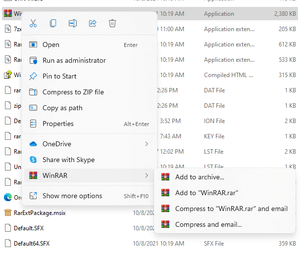
There's some good work in the context menus - they've reduced the common actions (cut, copy, rename, share, delete etc) to icons across the top and "copy as path" is a nice addition but it looks like they're trying to stop third parties cluttering up this menu and are pushing them all to a submenu (which is basically the old right-click context menu) which is an extra click. They did, of course, find space for a "Share with Skype" link on the primary menu.

Edit - I've just seen that the newest beta of WinRAR has native context menu entries so at least it's not something MS has actively prevented from happening.

dysfunction
FH is my second home
- Joined
- Dec 22, 2003
- Messages
- 9,709
How much right clicking on stuff do you do??
It's not something i do on a regular basis so dont see this as much of an issue really.
Or if you need other options just do Shift+F10 which will be quicker
It's not something i do on a regular basis so dont see this as much of an issue really.
Or if you need other options just do Shift+F10 which will be quicker
- Joined
- Dec 22, 2003
- Messages
- 12,557
Context menus have been shit for years though, mostly because there's no structure enforced, this sounds a bit naff but even if it just forces each app into having to use it's own submenu it would be betterThis is actually really getting on my tits. It's not just the desktop but all right-click context menus and you have to go through the "show more options" to get to *any* third-party menu-entries - eg opening a media file in MediaInfo.
There's some good work in the context menus - they've reduced the common actions (cut, copy, rename, share, delete etc) to icons across the top and "copy as path" is a nice addition but it looks like they're trying to stop third parties cluttering up this menu and are pushing them all to a submenu (which is basically the old right-click context menu) which is an extra click. They did, of course, find space for a "Share with Skype" link on the primary menu.
Edit - I've just seen that the newest beta of WinRAR has native context menu entries so at least it's not something MS has actively prevented from happening.

Yeah I like the look of the WinRAR screenshot above - all the common stuff at the top and then third-party entries in a separate section below. I don't know how the order is implemented but like you say there's no structure so it seems like a free for all which leads to some very messy context menus. It'd be nice if you could customise the menus to re-order them or stop certain apps appearing at all. You can do it on a per-app basis but I'd like to be able to do it on the OS level.Context menus have been shit for years though, mostly because there's no structure enforced, this sounds a bit naff but even if it just forces each app into having to use it's own submenu it would be better
Enough that I notice it when I have to do that extra click. I've been watching a foreign language TV show recently and finding good English subs has been a bit of a nightmare (not only are some of the subs I've found very obviously just whacked through Google Translate but the seasons were edited into different numbers of episodes depending on the market and even the season numbers aren't universalHow much right clicking on stuff do you do??
 ) so checking what audio tracks and subs are in a mkv has been something I've been doing a lot over the last few days.
old.Osy
No longer scrounging, still a bastard.
- Joined
- Dec 22, 2003
- Messages
- 2,753
fyi, AMD has released a driver fix for the Win11 performance issues:
old.Osy
No longer scrounging, still a bastard.
- Joined
- Dec 22, 2003
- Messages
- 2,753
fyi, AMD has released a driver fix for the Win11 performance issues:
Also, Microsoft already fixed the cache issue last week in the Preview Build: Releasing Windows 11 Build 22000.282 to Beta and Release Preview Channels
Overdriven
Dumpster Fire of The South
- Joined
- Jan 23, 2004
- Messages
- 12,911
- Thread starter
- #48
They've also fixed the issue where task manager is completely empty which pissed me off for about a week.
It feels much more stable now than it did a few weeks ago, UI is more fluent and things (mostly) are more responsive.
The native Teams client is now also less shit.
It feels much more stable now than it did a few weeks ago, UI is more fluent and things (mostly) are more responsive.
The native Teams client is now also less shit.
- Joined
- Dec 22, 2003
- Messages
- 38,671
I miss right-click on the taskbar > task manager.They've also fixed the issue where task manager is completely empty which pissed me off for about a week.
And frankly, the windows button in the middle of the taskbar looks much better - but it means I have to actually look where I want to click with my mouse to use it instead of knowing "bottom left".
Form over function

Wij
I am a FH squatter
- Joined
- Dec 23, 2003
- Messages
- 18,404
Ctrl+Shift+Esc ffs.I miss right-click on the taskbar > task manager.
And frankly, the windows button in the middle of the taskbar looks much better - but it means I have to actually look where I want to click with my mouse to use it instead of knowing "bottom left".
Form over function

Where did you people learn computers?
- Joined
- Dec 22, 2003
- Messages
- 38,671
I don't always have my keyboard on my lap.Ctrl+Shift+Esc ffs.
Where did you people learn computers?
dysfunction
FH is my second home
- Joined
- Dec 22, 2003
- Messages
- 9,709
Ctrl+Shift+Esc ffs.
Where did you people learn computers?
Easier with a simple mouse click
Wij
I am a FH squatter
- Joined
- Dec 23, 2003
- Messages
- 18,404
Whaaaaaat?Easier with a simple mouse click
One of the first things I noticed too - Task Manager is there if you right-click on the Start button (and yes it's annoying that you can't just wang the mouse into the bottom left and click to bring up the Start menu.I miss right-click on the taskbar > task manager.
Ffs, I didn't realise it was moveable. :\ I knew MS had shut down the ability to drag the taskbar to different edges of the desktop so assumed they'd locked down the centred bit as well. Much better in the corner.First thing I did was put the start menu back in the corner. Don't understand why you'd want it around the middle.
It seemed like such a Apple-y gimmick to put it in the middle - I'm sure they did focus groups and whatnot and maybe with higher res or bigger screens it's less mouse movement to get to the start button and open application icons or maybe it was more intuitive for a touch interface or something but I wasn't a fan. I'm on a 3840px wide ultrawide and I still want it all in the bottom left.
Overdriven
Dumpster Fire of The South
- Joined
- Jan 23, 2004
- Messages
- 12,911
- Thread starter
- #57
I'm still annoyed you can't move the bar to the top of the screen.
Bob007
Prince Among Men
- Joined
- Dec 22, 2003
- Messages
- 585
I'm still annoyed you can't move the bar to the top of the screen.
There is a reg hack for that, but i've not tried it myself so can't say if it has any issues.
How to Move the Taskbar to the Top in Windows 11
With a registry tweak, you can relocate the taskbar from the bottom to the top of the display.
I believe it will return soon. But not sure how soon soon is.
old.Osy
No longer scrounging, still a bastard.
- Joined
- Dec 22, 2003
- Messages
- 2,753

Start11: The ultimate Start menu replacement for Windows 10 and 11. Restore the classic look and add new functionality.
Start11: The ultimate Start menu replacement for Windows 10 and 11. Restore the classic look and add new functionality.
www.stardock.com
old.Osy
No longer scrounging, still a bastard.
- Joined
- Dec 22, 2003
- Messages
- 2,753

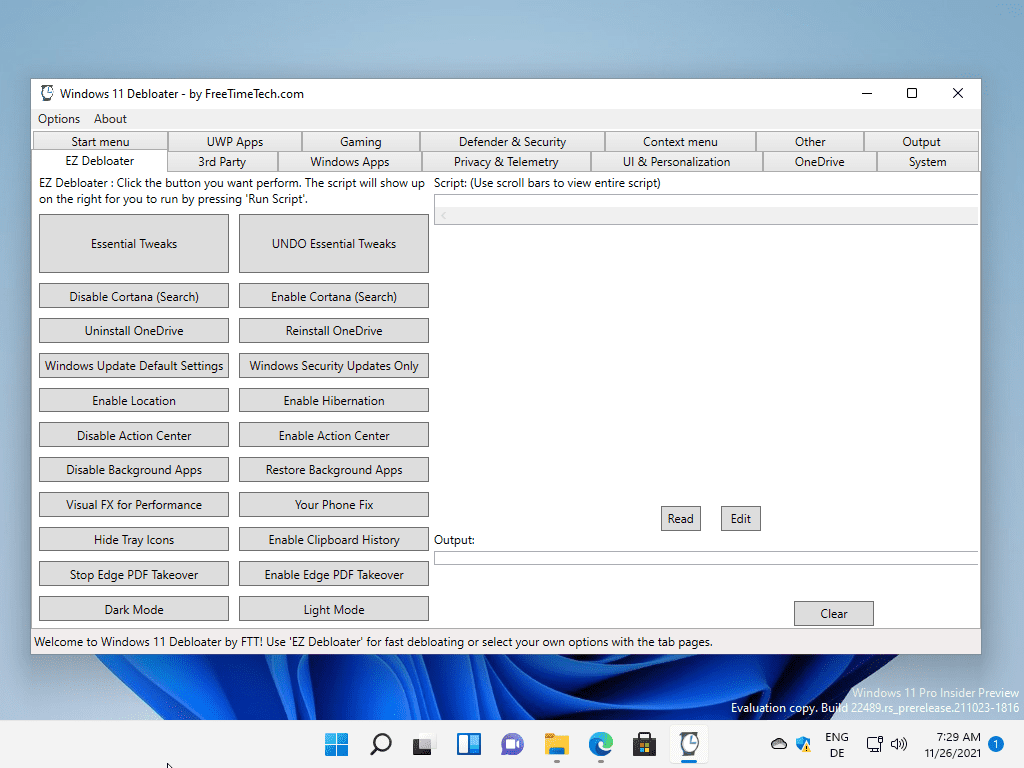
Windows 11 Debloater is a powerful but confusing tweaker - gHacks Tech News
Windows 11 Debloater is a free portable tweaker for Microsoft's Windows 11 operating system.
Users who are viewing this thread
Total: 2 (members: 0, guests: 2)
