FreddyWebDev Design Awards 2005

Shovel

Can't get enough of FH
Joined
Dec 22, 2003
Messages
1,350
A competition I just invented. Nominate a maximum of two sites that you rate highly for their overall design. There's no restriction on them being business sites or personal sites, just need to be something special.

There's nothing official about this, but here's the criteria I considered when making my choice:
  • Unique appearance
  • Web Standards compliance
  • Accessibility (with regards to disabled net users and preferential keyboard navigation)
  • Pushing of the envelope

And all that Malarkey
I've never, ever seen a design like it. It's a personal site, but visually inspired by print magazine design. The entire site is in valid XHTML and CSS and pretty much by implication is extremely accessible on all counts.
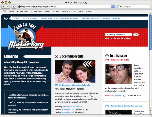


Better yet, it pushes the limits of CSS support in modern web browsers. To view the site in full-colour glory you need to use Firefox, Opera, Safari or any other current, standards compliant browser. If you visit using IE6 or below, however, you actually get a completely different (and technically simpler) design.
The design doesn't get altered using script or browser sniffing, it all happens using advanced CSS selectors to apply different styles to newer supporting browsers, and using some known bugs to apply different styles only to IE. It's seamless.

So, for producing two aesthetically awesome designs using web standards and experimenting with some truely bleeding edge techniques for graceful degredation, I would give an award to And all that Malarkey.

I should stress that you can learn a huge, huge, huge amount by reading around that site, too. He's a clever guy and all.

Right then, your turn. ;)
 

JingleBells

FH is my second home
Joined
Mar 25, 2004
Messages
2,224
UEFA.com - they recently redesigned their site, and even though its not quite XHTML compliant (the JS ads seem to mess it all up), it's still a tableless design and makes extensive use of CSS. For a site from such a large organisation, which probably receives shit-loads of visitors, it's impressive. They've even embraced RSS which is very useful indeed :)
 

TdC

Trem's hunky sex love muffin
Joined
Dec 20, 2003
Messages
30,925
that dontclick.it is the greatest thing I've ever seen. seriously impressed. I want that in html. make it so w3c.
 

Shovel

Can't get enough of FH
Joined
Dec 22, 2003
Messages
1,350
TdC said:
that dontclick.it is the greatest thing I've ever seen. seriously impressed. I want that in html. make it so w3c.

DOM Level 3 (via JavaScript) + SVG + XHTML + CSS3

The specs exist, but they're very new (or barely into Candidate Recommendation status). Thus, browser support is 'experimental' at best.
 

Chilly

Balls of steel
Joined
Dec 22, 2003
Messages
9,047
Maljonic said:
I think this one is kind of interesting: http://www.dontclick.it
nice idea, but if you run it on anything but a pretty good computer it is *painfully* slow. I'm running it on my 2.2ghz laptop and its jerky and slow to transition.
 

TdC

Trem's hunky sex love muffin
Joined
Dec 20, 2003
Messages
30,925
strange dude. I'm running it on a 2.4GHz cellery at workies with a shared mem gfx card and all is spinky. maybe I'm just toes-over the spec then?
 

Penguin

Fledgling Freddie
Joined
May 11, 2005
Messages
375
I'm sure i've seen Hoogerbrugge.com before, rings a bell. It's a great website, so different, and odd. Definately more arty but i like it. It gets boring for me though even though i think it's pretty cool.
 

Alliandre

Fledgling Freddie
Joined
Dec 28, 2003
Messages
202
Maljonic said:
I think this one is kind of interesting: http://www.dontclick.it

I like the the idea of just having a mouse over for boxes within a page, but for navigating between the pages where almost everything on the page changes I like the clicking to know that I've gone onto a new section as such.

Something quite as "free flowing" as that page makes me feel I don't know whether I've seen everything, and also I don't know where I want to go next. The non consistency with the position of the stuff in the main navigation bar at the top may have something to do with this. It might have worked better if that had stayed in the right place.
 

MKJ

Fledgling Freddie
Joined
Jun 5, 2004
Messages
1,196
Looked at a few mentioned.

And all that Malarkey - nicely constructed nodoubt but the choice of colours is a bit iffy I think. Black background with white text? Hard on the eyes for sure.

dontclick.it - interesting but the way things move about the screen I felt quite queazy in notime :puke: .

klangtausch.de - found this one a bit scarey. Not sure I like flash sites that much to be honest.

hoogerbrugge.com - this one gets my vote. Very appealing and interesting.

MKJ
Me own poxy site
 

tRoG

Fledgling Freddie
Joined
Dec 22, 2003
Messages
1,440
Hoogerbrugge is my favourite, also. Interesting, and it looks pretty.
 

Shovel

Can't get enough of FH
Joined
Dec 22, 2003
Messages
1,350
MKJ said:
And all that Malarkey - nicely constructed nodoubt but the choice of colours is a bit iffy I think. Black background with white text? Hard on the eyes for sure.

I've spent about 3 days wondering what of earth you're talking about, until I finally twigged that you were viewing the IE version. You may have a point about contrast, but on the other hand I do smile wryly when considering IE6 to be like a black&white television compared to full-colour alternatives. It is of course a personal site, and the majority of Andy's users had dumped IE before this redesign.

Following on from the Flash-based mouseover-fest above: Some of you may rather like Shaun Inman's personal site, particularly the Navigate/Search functionality.
 

.Wilier.

One of Freddy's beloved
Joined
Dec 22, 2003
Messages
798
Thought Id post one that one of my great friends designed......some of you may know him ;)

www.abyteapart.com

Took him a while, and Ive not put much content in, but its a cracking design imho.
 

Padwah

Fledgling Freddie
Joined
Dec 25, 2003
Messages
127
Love the header but the rest of the site could do with some more padding on the main content area, though seeing as that's my only complaint its safe to say that I like it :D
 

Maljonic

Can't get enough of FH
Joined
Dec 22, 2003
Messages
1,297
This one's kind of different: http://www.tokyoplastic.com/

To save time > you have to click on the Japanese text (says Tokyo Plastic) at the top, then the Japanese flag then the text above the chair that says enter in Japanese katakana. :)
 

Users who are viewing this thread

Top Bottom