Competition Help! Rabbits!!! . . . . *and excel

Scouse

Giant Thundercunt
FH Subscriber
Joined
Dec 22, 2003
Messages
36,790
OK - so struggling to do this.

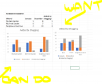
I've a dataset, as represented below. I want to show the numbers in January and the numbers in december side-by-side in graph format.

I then want to show the increase (added by shagging) on TOP of the december numbers (or as a proportion thereof) - in a two-tone bar - as mocked up in mspaint on the right.

The three-column graph is no use to me. I need to show two columns, with the second columns numbers (december) indicating what the difference is added by shagging.

HELP!
upload_2018-11-9_15-56-46.png

If it *cannot* be done, how do I represent this in a similar, but logical and easy to understand way?
 

caLLous

I am a FH squatter
Joined
Dec 23, 2003
Messages
18,529
Could you not cheat and compose the second chart of "December + the increase" rather than "January including the increase"? I've no idea about Excel, I could probably do it in matplotlib.

(Your neighbour needs to have a word)

(I think you have December and January the wrong way round)
 

Scouse

Giant Thundercunt
FH Subscriber
Joined
Dec 22, 2003
Messages
36,790
Jan>Dec are the right way round - show an increase. I'd like to be able to visually show that increase (or decrease, in the case of death by pie).

Manual is a pain. Too much data.
 

dysfunction

FH is my second home
Joined
Dec 22, 2003
Messages
9,709
Why use a stupid graph where the table tells the story much clearer.

Do you ever see a graph for the football league tables??
 

Job

The Carl Pilkington of Freddyshouse
Joined
Dec 22, 2003
Messages
21,652
I used to very good with paint shop pro and made most of the graphs for the office, fuck using excel..its frickin painful.
 

caLLous

I am a FH squatter
Joined
Dec 23, 2003
Messages
18,529
I used to very good with paint shop pro and made most of the graphs for the office, fuck using excel..its frickin painful.
Somebody has never worked with large datasets before.

Jan>Dec are the right way round - show an increase. I'd like to be able to visually show that increase (or decrease, in the case of death by pie).

Manual is a pain. Too much data.
Why are you even showing January if you can looked at the December (including the change) and work January out from that? Why don't you just do a single stacked bar for each location?
 

Job

The Carl Pilkington of Freddyshouse
Joined
Dec 22, 2003
Messages
21,652
Oh yes I archived them all and keep them safe on a thumbdrive in a locket around my neck.
 

Scouse

Giant Thundercunt
FH Subscriber
Joined
Dec 22, 2003
Messages
36,790
Don't lie Job. We all know you can't use a thumb drive.
 

Users who are viewing this thread

Top Bottom