Mxn v4?

v4?


  • Total voters
    187

MxN

Can't get enough of FH
Joined
Nov 29, 2004
Messages
1,425
Well v3 has been out for a while now and im getting kinda, Bored of it,

Was thinking of some change's but not sure on what i should do, ive basicly Ran out of idea's

So Im posting here to hear from people who use my UI or for people that have idea's on what a UI should have.

Looking for any comments\idea's to make v4 r0xb0x

Looking for replys on the lines of this

[ ]New colors
[ ]New Look
[ ]Different mini grps
[ ]Different Target bar
[ ]Different Health\end\power bars

Maybe try a Wow theme look?

Ive used, seen xxxxxxx UI and i like the xxxxxx in it, <insert image>

Or Shall i just Update v3 with furture Patch's?

anyway enough bs just looking for inspiration!

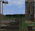
For people who dont know what my UI looks like or wanna try it

www.mxn.r8.org

Edit Poll is kinda shit but they are so fotm ;/
 

Kinag

Part of the furniture
Joined
Dec 22, 2003
Messages
3,217
I got some great ideas as I already love your UI

[1] Perhaps try to make 2 different summary windows, one for tank without power bar and one for casters with a power bar, make them so they are all attached and perhaps put in a realm rank window inside the summary window.

[2] A crimson/Dark red theme would be neat

[3] The target bar is really neat to have, it's very nice since it's quite visible, but add a target window inside the summary window perhaps.

I personally like your UI since it's partially transparent and it quite nice if you have sour eyes.

Keep up the good work :)

edit: I hooked both of them since both is a good idea ;p keep the original design but perhaps make a new graphical design for others :)
 

Andrilyn

Can't get enough of FH
Joined
Feb 1, 2004
Messages
1,965
Also can you make it so keys don't 'fall off' at a long sentance?
For instance (don't know if this is your UI only but) if you typ a sentance and it's too long for the text box to handle it in 1 line (doesn't matter what size your text box is) then the first letter of the first word on the second line ain't there for some reason.
Not really game breaking though quite annoying sometimes :)
 

MxN

Can't get enough of FH
Joined
Nov 29, 2004
Messages
1,425
Andrilyn said:
Also can you make it so keys don't 'fall off' at a long sentance?
For instance (don't know if this is your UI only but) if you typ a sentance and it's too long for the text box to handle it in 1 line (doesn't matter what size your text box is) then the first letter of the first word on the second line ain't there for some reason.
Not really game breaking though quite annoying sometimes :)

Aye people have pointed that out to me recently easy fixed
 

Gamah

Banned
Joined
Dec 22, 2003
Messages
13,042
You need to fix the tools bar (Not sure of the name) the one that lists RR titles, rps for RR etc, currently they all show though whats on the top. Kinda annoying. Also maybe make the target bar a little longer, its kinda irritating when names get cut off.
 

Loverman

Fledgling Freddie
Joined
Sep 2, 2004
Messages
38
For new features. I dunno if it's possible, but I would like to see more chatbars.

I usually use all the different channels. Having to remove BattleGroup to have a single channel for OfficerChat seems, well so 1980.
(and no, I don't use /g /broad and whatnot, call me gimp if you wanna)

Mayby try some different compasses?


Edit - oh nerf, didn't see you weren't interested in this kinda stuff. Nwm then. I post anyway :)
 

MxN

Can't get enough of FH
Joined
Nov 29, 2004
Messages
1,425
Loverman said:
Edit - oh nerf, didn't see you weren't interested in this kinda stuff. Nwm then. I post anyway :)

i was
 

Lomme

Fledgling Freddie
Joined
Dec 23, 2003
Messages
486
only thing i find annoying with your ui, is the zone names on the /rw map :p would be nice if they would stay gone after clicking on map, even after relogging/zoning.
other than that, great work :)
 

Zovic

Fledgling Freddie
Joined
Feb 11, 2005
Messages
227
I like the design as it is, so just update v3 for patches too come imo!
 

Prudil

One of Freddy's beloved
Joined
Dec 24, 2003
Messages
458
What Zovic said ;)

Simple is good....dont make MXN UI another yankee-doodle-fluffy-ui-with-so-much-info-that-is-not-needed.

Love the UI as it is....

Only thing I would find usefull was a status window displaying the different timers if they are up/down (pots, waterpots, artifacts, championweapons) stuff that generally dont show with a grayed out icon ;) Probably a longshot tho :)
 

Jarroman

Fledgling Freddie
Joined
Aug 27, 2004
Messages
216
the thingy about diferent summaries for tanks (without power)etc , i think it would be kinda useless :eek7: classes that had no power so far will get a power pool on DR release no ?
 

MxN

Can't get enough of FH
Joined
Nov 29, 2004
Messages
1,425
Prudil said:
What Zovic said ;)

Simple is good....dont make MXN UI another yankee-doodle-fluffy-ui-with-so-much-info-that-is-not-needed.

Love the UI as it is....

Only thing I would find usefull was a status window displaying the different timers if they are up/down (pots, waterpots, artifacts, championweapons) stuff that generally dont show with a grayed out icon ;) Probably a longshot tho :)

You mean tooltips?
 

Prudil

One of Freddy's beloved
Joined
Dec 24, 2003
Messages
458
Hehe no ;)

With todays /use macros for pots and use/use2 abilities on artifacts plus the incoming champion weapons with use/use2 abilities on em, the need to keep track on the different timers is something I would find handy, today I just spam the stuff telling me I have to "wait another xx seconds to use that ability".

There are seperate timers on

Ordinary pots
Waterbreethe pots
Artifact abilities
Champion weap abilities

A little window like the lag-o-meter would be ace (POT-ARTI-WP-CHAMP)
Red indicating "down", green "up"....etc :D
 

Spamb0t

Fledgling Freddie
Joined
Feb 4, 2004
Messages
966
uuh poll results atm:

Update v3 for patches too come 22 55.00%
Rework the complete UI for summin totatly new looking 21 52.50%

55% + 52,5% ? :rolleyes:
 

Carter

Banned
Joined
Jan 15, 2006
Messages
74
Spamb0t said:
uuh poll results atm:

Update v3 for patches too come 22 55.00%
Rework the complete UI for summin totatly new looking 21 52.50%

55% + 52,5% ? :rolleyes:

which is correct. it's this part :

multiple Choice Poll. Voters: 41. You have already voted on this poll

which is wrong
 

Saraden

Loyal Freddie
Joined
Apr 2, 2004
Messages
281
i would like to see option for bigger minigrp. With higher resolutions it get's too tiny :(
 
Joined
Dec 31, 2003
Messages
1,875
I'm not a big fan of your UI at all, or any one elses for that matter. The main reason for that is that they lack alot of things i.e an option to make some own customization ( a la WoW ), for exampel I like the QBars, the HP, END bar looking things with your UI, but I hate the chat window, the war-map and the way the charcter window/inventory window looks like.
If you could costomize the UI more freely that would make atleast me love your UI, and maybe some other ppl feel the same :p
 

MxN

Can't get enough of FH
Joined
Nov 29, 2004
Messages
1,425
Matriarch|Sneakers said:
I'm not a big fan of your UI at all, or any one elses for that matter. The main reason for that is that they lack alot of things i.e an option to make some own customization ( a la WoW ), for exampel I like the QBars, the HP, END bar looking things with your UI, but I hate the chat window, the war-map and the way the charcter window/inventory window looks like.
If you could costomize the UI more freely that would make atleast me love your UI, and maybe some other ppl feel the same :p

And maybe your limited to what can be changed in Daoc UI's due too mythic hardcoding stuff
 

Konah

Fledgling Freddie
Joined
Dec 24, 2003
Messages
2,110
go for the best minimalist rvr ui and change the txt buttons on char/inv etc back to (small) symbols, only reason i can remember why i dont use ur ui atm.
txt just stands out too much and tbh looks messy imo.
 

Prudil

One of Freddy's beloved
Joined
Dec 24, 2003
Messages
458
When viewing housevault in "full view" (not pages) there seem to be a slight gfx bug for the different item slots. Switching to pages fixes this minor bug ;)
 

Benkt

Regular Freddie
Joined
Jul 31, 2005
Messages
7
Is it possible to get those "disable" timers in your UI?

/edit by just holding the mouse over the icon
 

Attachments

  • timer.jpg
    timer.jpg
    84.1 KB · Views: 110

MxN

Can't get enough of FH
Joined
Nov 29, 2004
Messages
1,425
Benkt said:
Is it possible to get those "disable" timers in your UI?

/edit by just holding the mouse over the icon

yes
 

Ridje

Fledgling Freddie
Joined
Jan 28, 2005
Messages
242
thats all want you to do baby


add timers tbh i can never see when stuffs up and if it is or not or is this in the latest one?


i.e battler up in 1:20 mins ETC !!! (K)
 

MxN

Can't get enough of FH
Joined
Nov 29, 2004
Messages
1,425
Ridje said:
thats all want you to do baby


add timers tbh i can never see when stuffs up and if it is or not or is this in the latest one?


i.e battler up in 1:20 mins ETC !!! (K)

K time to use caps, fucked off how people dont read

WHEN U DOWNLOAD THE UI
UNZIP THE UI INTO THE CUSTOM FOLDER
CLICK ON COMPONENTCHOOSER.EXE
CLICK ON THE THING YOU WANT TO CHANGE/ADD
I.E TOOLTIPS :: CLICK TOOLTIPS THEN CLICK USE
COMPASS :: CLICK THE COMPASS U WANT THEN CLICK USE

ETC ETC


better
 

illu

Part of the furniture
Joined
Mar 18, 2004
Messages
1,867
hehe

You might need to do some instructions - but it is relatively straight forward.

Installed your UI for the first time tonight, and I really like the initial look of it and the possibility of really going minimal with everything - so hopefully fps will go up and fraps recordings will be a bit smoother.

I'll play with it a bit more tomorrow. Nice work though :>

Oli - Illu

PS The only button I haven't found immediately is the bonuses button yet (resistances/melee speed etc) - but I'm sure I'll find it tomorrow :>
 

Nate

FH is my second home
Joined
Mar 13, 2004
Messages
7,454
aye i get that problem with the vault view too, think that needs a fix :) very nice ui mxn, i think stick with it just give a wider colour range
 

Gamah

Banned
Joined
Dec 22, 2003
Messages
13,042
Also add an option for the Derida /rw maps I dont like the ones in MXN :<
 

Users who are viewing this thread

Top Bottom